UX Lead I 2023
I redesigned a legacy enterprise Unified Communication app for contact center agents (for example, customer service representatives) to manage their customer calls, chats, emails, social media, etc.
Contact Center App Redesign

Mitel is the world’s second-largest provider of unified communications solutions, offering VoIP, call services, contact center, and collaboration tools primarily for businesses of all sizes. Serving customers from small businesses to large enterprises, Mitel enables seamless and efficient communication across and within teams.
About the Company
Mitel Ignite, was a legacy enterprise Unified Communication web application, designed for contact center agents to manage and handle their customer interactions across various communication channels, such as calls, chats, emails, social media, etc.
It had become struggled with significant UX challenges due to the following:
-
Outdated design;
-
Technological constraints;
-
Absence of multiple key functions;
-
Lack of continuous maintenance.
How did it start

Project Basic Info
Key Stakeholders
* Project Manager
* Channel Partners
* Sales Team
* Contact Center Agents
* Engineering Team
User Base
* Over 500K contact center agents
* Over 2 billion business connections
My Role
Solo UX Lead, owned the entire end-to-end process:
* Design Strategy;
* User Research & Analysis;
* Concepts, Hi-Fi Design
* Component Library
* VPAT accessibility report
Platform
Web & Desktop
Project Duration
~ 8 months
To address these issues, I began with a heuristic evaluation of the old product and collaborated closely with channel vendors. Leveraging those initial research findings, I drafted some early-stage design concepts and conducted multiple rounds of user interviews with existing agents. During these sessions, I presented various design proposals and guided discussions with pre-defined questionnaires. The feedback from these interviews not only validated many of my initial assumptions but also provided crucial insights into the legacy product's weaknesses and areas for improvement.
Deliverables including:
-
Old product heuristic evaluation
-
Ideation sketches and explorations
-
User research and user interview
-
Interview findings and summary
-
User flows
-
Low-fidelity prototypes
-
Iterative updates design
-
High-fidelity prototypes
-
Documentation
Process & Deliverables:

After understanding the project background and initial meetings with stakeholders, I started my UX work by performing a comprehensive design evaluation of the old product using Jakob Nielsen’s 10 usability heuristics.
Design Critique of Old Product
Jakob Nielsen's 10 usability heuristics remains as a valuable tool for user interface design.
I used a 5-point severity scale to assess usability issues and I compiled a full report for the old product.


I’ll skip the detailed findings, but in short, the results revealed that nearly all areas failed the evaluation, making it clear that a comprehensive redesign was necessary.
To gain a deep understanding of user needs, behaviors, and potential pain points in the old Ignite product used by contact center agents, I recruited 22 contact center experts (18 agents and 4 supervisors). I conducted several rounds of user research through interviews and surveys.
I also shared some of the key findings below.
User Research


Based on the design critique of Ignite old product as well as user research data, I listed out 4 main painpoints & challenges to focus on:
1. Outdated user interface:
The current interface is not only visually outdated but also fails to provide an intuitive user experience. The lack of modern design principles results in a steep learning curve and impairs user productivity. A complete UI overhaul is necessary to enhance usability, aesthetic appeal, and overall user satisfaction.
2. Poor Information Architecture:
The navigation and information structure were confusing, makes it challenging for users to discover essential features and consume content. Although most information is grouped logically, but the hierarchy and content density could be overwhelming. Redesigning the visual hierarchy and proper use of modular designs are crucial.
3. Lack of Core features and Integration:
The platform’s lack of core features such as direct messages between call agents, enterprise directories, calendar integrations creates disjointed workflows. Users are forced to switch between different applications, leading to inefficiencies and decreased productivity. Addressing this gap by implementing seamless integrations is vital to streamlining workflows and enhancing the platform's value proposition.
4. Inadequate accessibility support:
Accessibility features within the platform are incomplete, with significant gaps especially in keyboard navigation and assistive technology support. This exclusionary design limits usability for individuals with disabilities and fails to meet modern accessibility standards. Improving accessibility is essential to making the platform more inclusive and compliant with industry best practices.
Painpoints & Challenges
Using insights gathered from heuristic evaluations and user research, I developed two primary user personas:
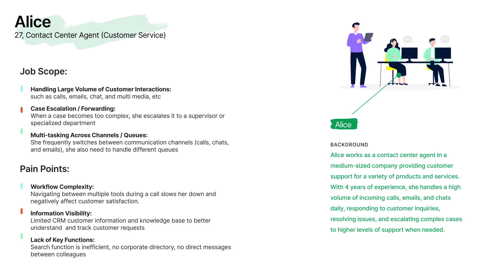
• Alice: a contact center agent who manages high volumes of customer interactions across multiple channels but struggles with workflow complexity, limited visibility of information, and lacks essential tools like unified search and colleague messaging.
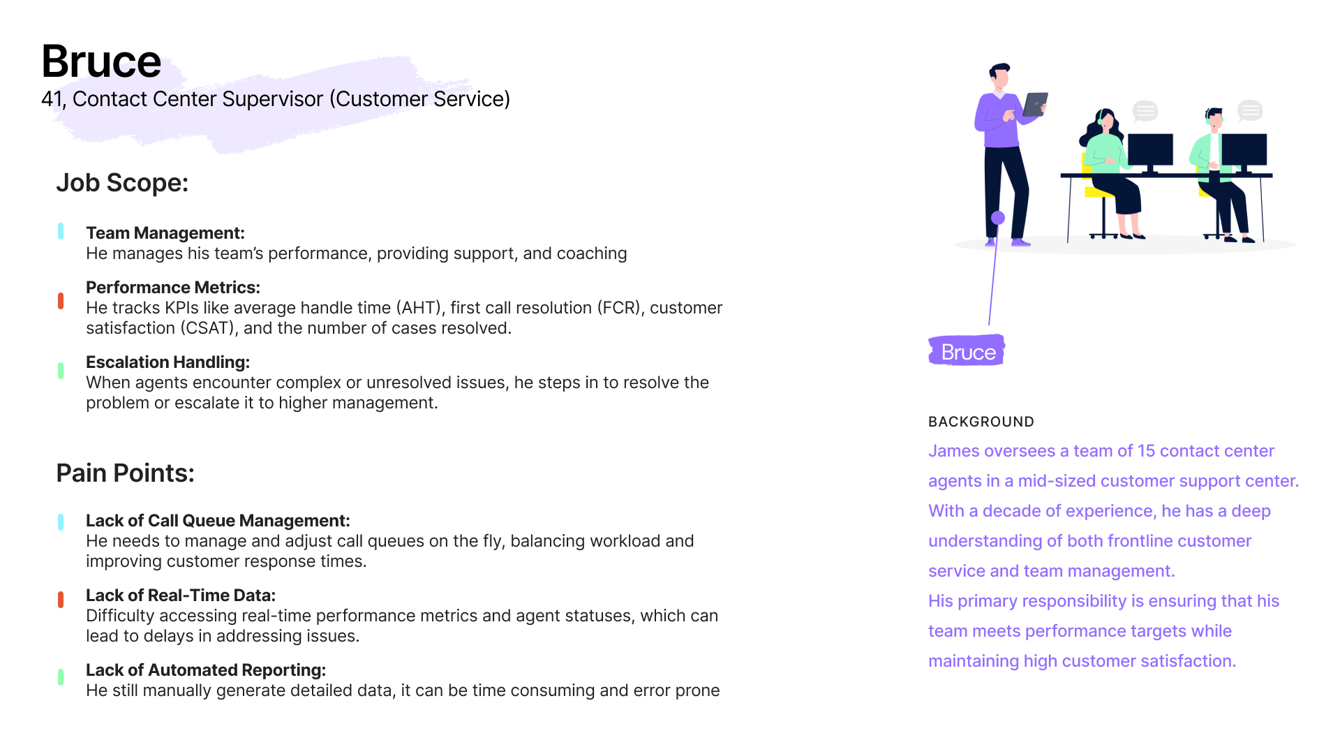
• Bruce: a contact center supervisor responsible for a team of 15 agents, focusing on performance targets, real-time data monitoring, and issue escalation. He encounters challenges with tracking real-time metrics, managing call queues, and handling manual reporting tasks.
User Persona
Drawing from insights gathered through heuristic evaluations and user research, and guided by the two user personas I developed, I identified several overarching design strategies to address pain points in the old Ignite product. These strategies aim to enhance the user experience, enabling agents to work more efficiently and effectively within a unified communications environment.
1. Leverage Mitel’s Atomic Design Library:
Adhere to Mitel’s newly established design components, utilizing standardized colors, typography, icons, and basic structural layouts to ensure consistency and coherence across the platform.
2. Relocate The “Contacts” Function Entry:
Instead of showing the “Contacts” on the right side, repositioning it as one of the primary navigation items. This repositioning will create a more intuitive and cohesive user experience by making essential functions more accessible.
3. Implement Global Search:
Replace the local search function with a powerful global search capability, enabling users to efficiently find relevant content across inbox, queues, contacts, messages, and more, thus streamlining navigation and information retrieval. Additionally, enable users to enter a phone number and dial directly from the global search bar.
4. Consolidate “Options” and “Tools” into “Settings”:
Merge the “Options” and “Tools” navigation entries into a single “Settings” category, as they offer similar functionalities. This consolidation will simplify navigation.
5. Integrate the “Messages” function:
Incorporate the “Messages” function into Ignite and present it as a convenient popup on all main screens. This integration will allow agents to conduct internal conversations without needing to toggle between different applications, thereby improving workflow efficiency.
6. Accessibility Compliance:
Increase font sizes and enhance the contrast ratio to meet accessibility standards, ensuring the platform is usable by individuals with varying levels of ability.
Design Strategy

Design Example
Given the complexity and scope of the project, I will use some design examples to showcase my user-centric design methodology.
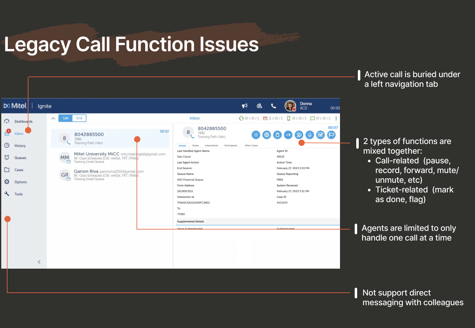
1. Call Function Optimization
One common use case for contact center agents is managing a high volume of daily incoming calls. However, the previous workflow presented several significant usability issues:
1. Active Call Access:
The active call interface was nested too deeply under a left navigation tab, forcing agents to exit the current screen and lose control of the ongoing call whenever they needed to view call history or case information.
2. Poor Button Hierarchy:
Call-related functions (e.g., pause, record, forward, mute/unmute) were intermingled with ticket-related actions (e.g., delete, mark as done, flag) in the same row, creating a confusing hierarchy.
3. Limited Call Handling:
Due to technical limitations, agents were restricted to handling only one call at a time, making it difficult to dial out for support from colleagues while actively on a call with a customer.
4. Lack of In-App Messaging:
User research indicated a strong need for direct messaging within the app, so agents could avoid switching to external platforms like MS Teams to communicate with team members.
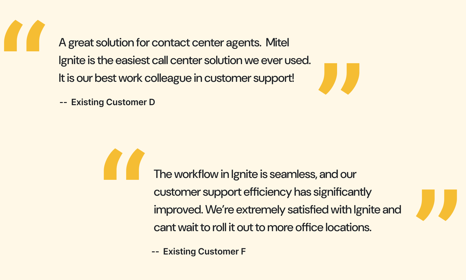
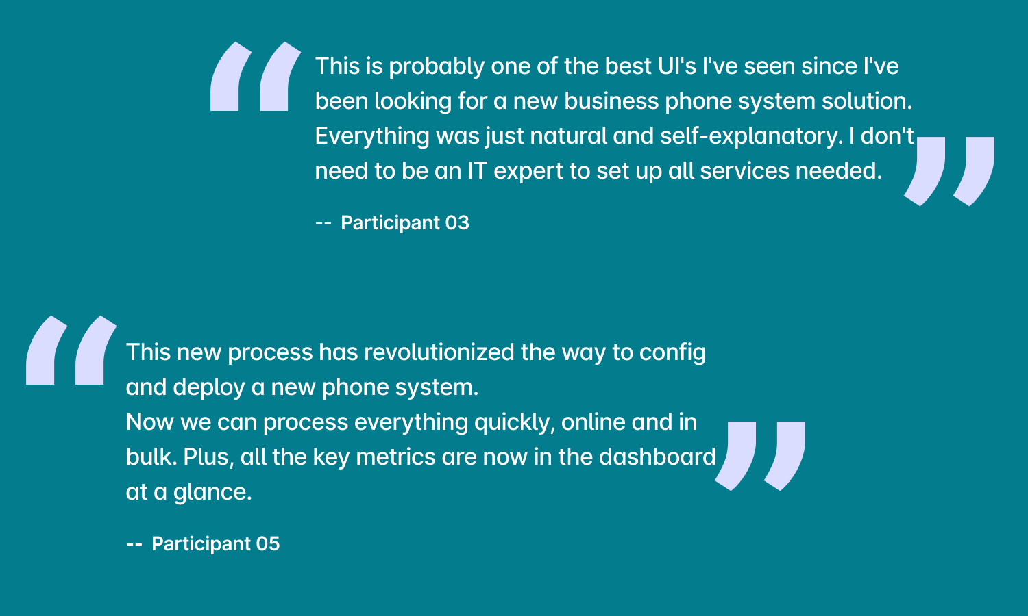
User Feedback
I tested the final design prototype with several customers and received overwhelmingly positive
feedback.
Below are two examples that highlight their appreciation for the user-centric design approach.
Take a look at my proposed design
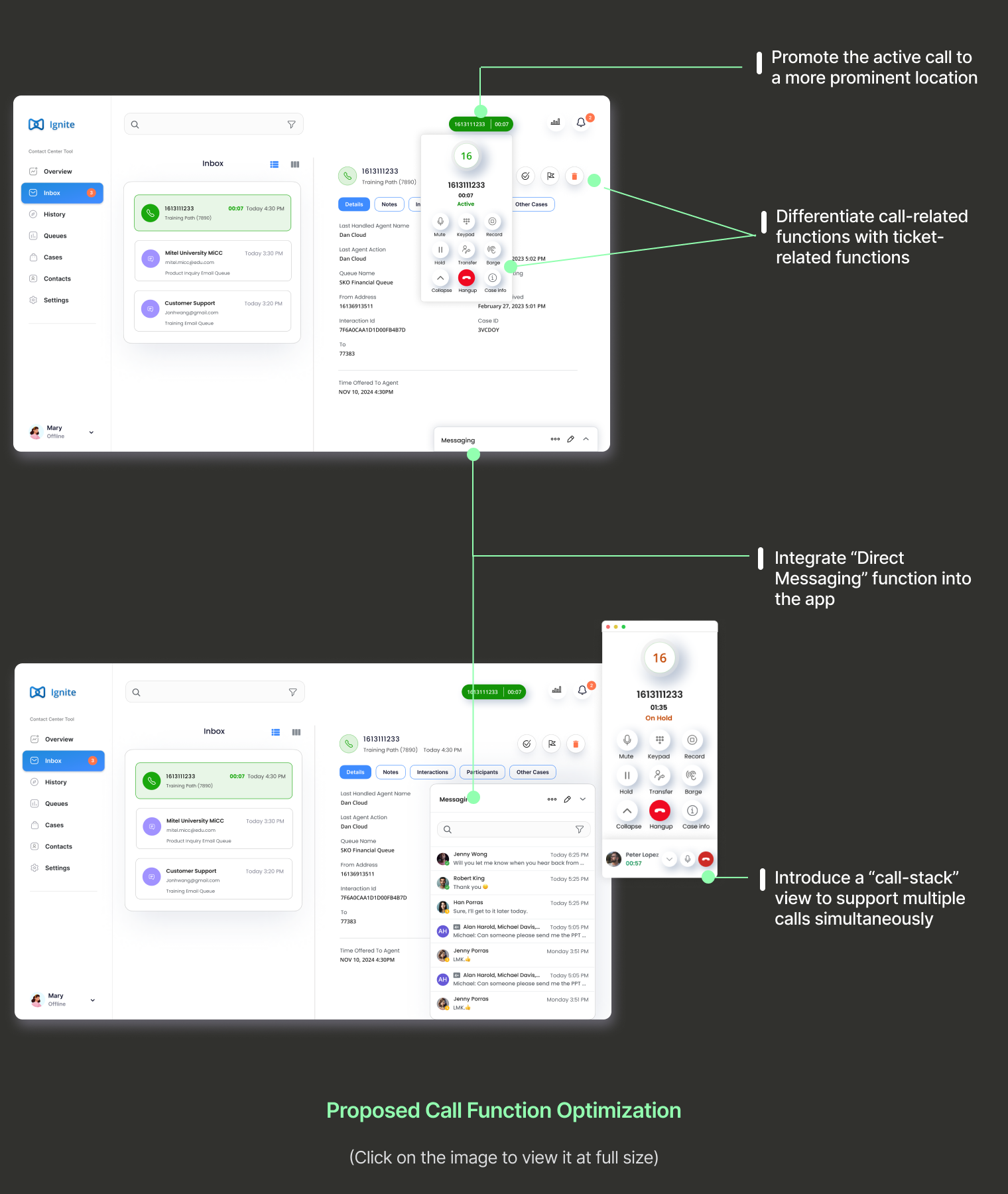
To address these four usability issues, I reimagined and enhanced the call handling functionalities as follows:
1. Elevate Active Call Visibility:
Recognizing the active call as a core task, I placed it in a prominent location on the interface. This allows agents to seamlessly switch between tabs without losing control over the active call.
2. Refine Button Hierarchy:
I separated call-related functions and ticket-related actions to reduce confusion, positioning call controls within the active call card and ticket actions within the ticket content header.
3. Expand Call Handling Capabilities:
I introduced a call stack feature that enables agents to manage multiple calls within a single, organized view.
4. Incorporate In-App Messaging:
To facilitate efficient team communication, I integrated a direct messaging feature within a side popup. This design choice allows agents to chat with colleagues without losing visibility into the active customer call.
Design Example
2. Agent Voice Greeting Management
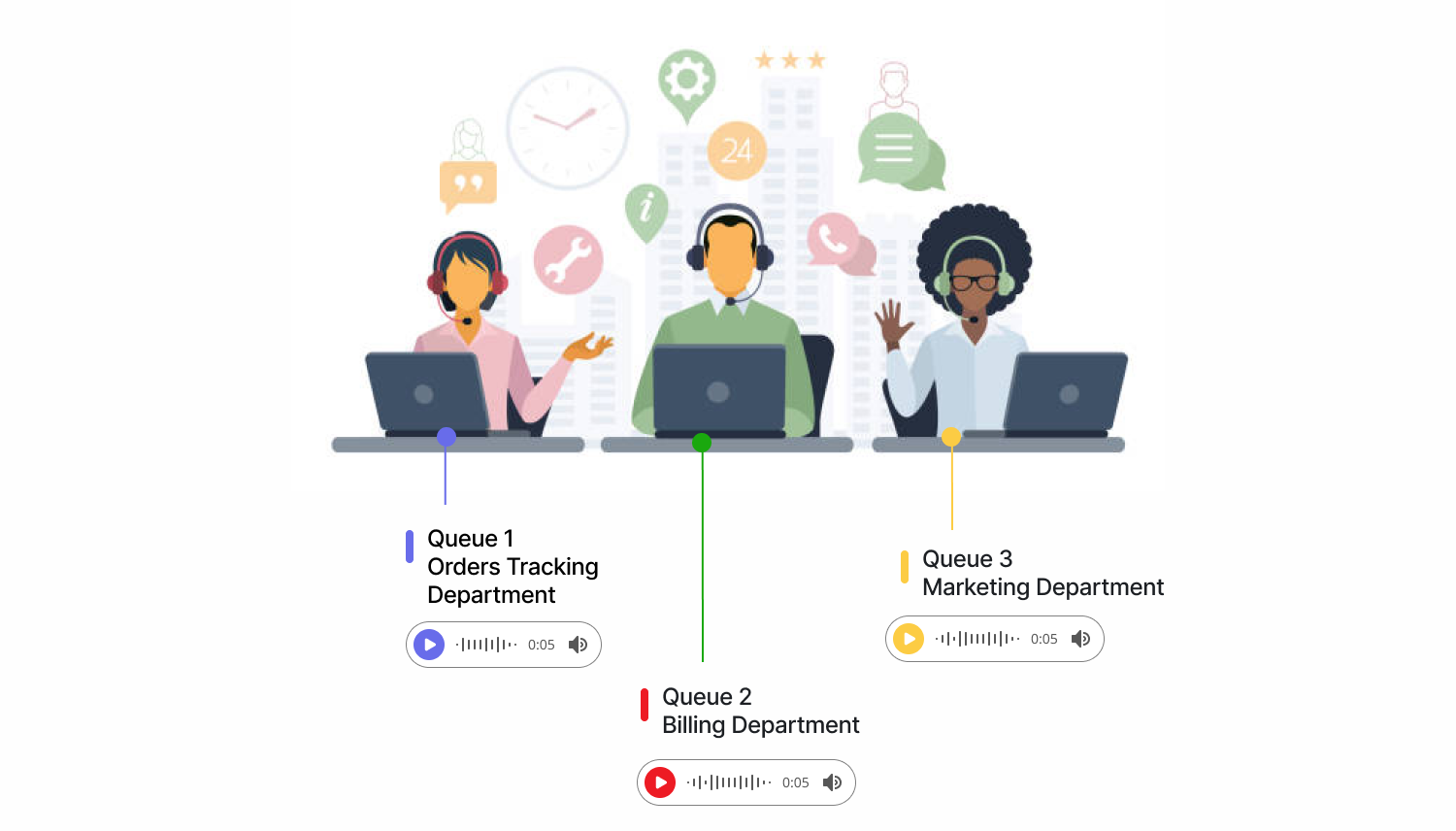
Before diving into the design, I’d like to clarify two industry-specific terms: “Voice Greeting” and “Queue.”
A voice greeting is a pre-recorded voice message that plays for customers when they call a company’s contact center. A queue, on the other hand, is a virtual waiting line where incoming calls, messages, or inquiries are held until an agent is available. Queues are often categorized by the type of customer need.
For example, at Amazon’s customer service center:
-
Queue 1 handles order tracking, with a voice greeting that says, “Thank you for calling Amazon. I’m here to help you track your package.”
-
Queue 2 is for billing, with a voice greeting that says, “Thank you for calling Amazon. I’m here to assist with payment or refund questions.”
-
Queue 3 focuses on product marketing inquiries, with a voice greeting like, “Thank you for calling Amazon. I’m here to assist you with any questions on discounts or promotions.”
Each queue has a specific voice greeting tailored to ensure Amazon customers are directed to the right department.
For this app, it provided the functionality for the contact center agents to record customized voice greetings and match them to the relevant queues. This allows for a seamless experience, making sure customers are directed to the appropriate support area right from the start.
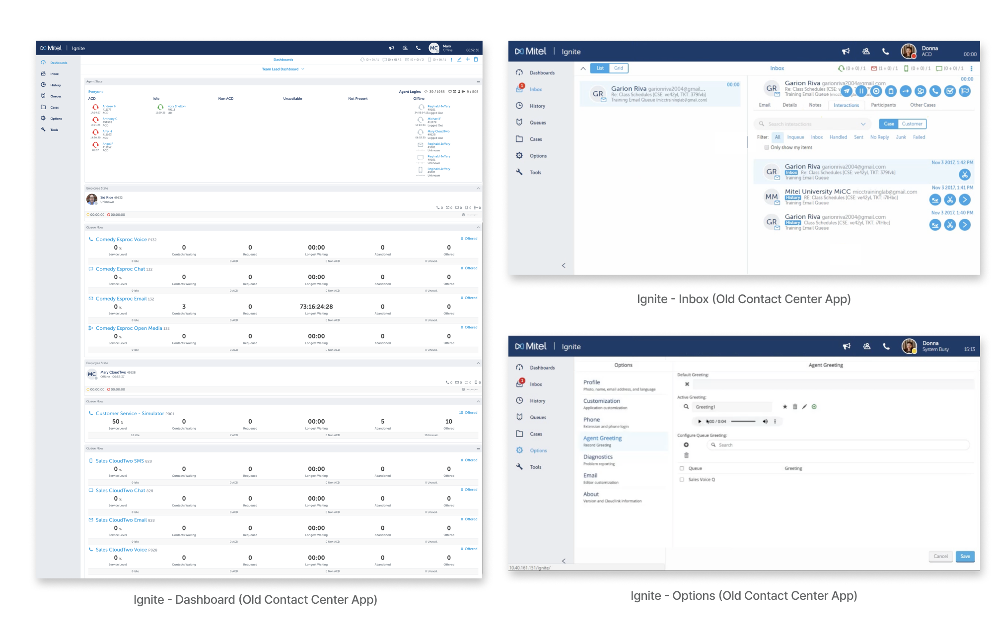
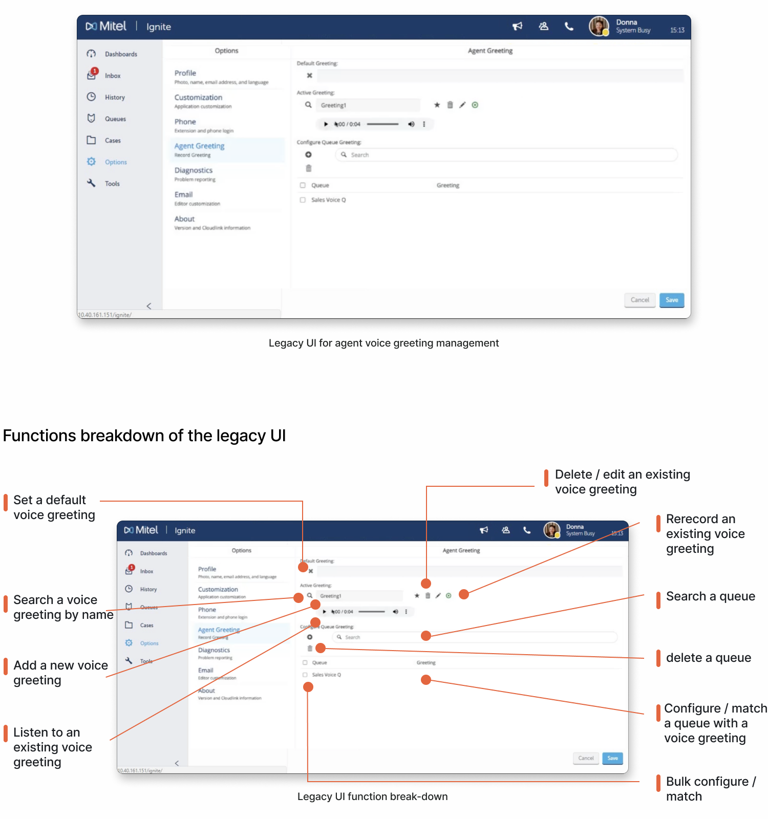
How did this function look like in the legacy product?
As shown in the screenshot below, while the previous UI provided all essential functionalities for agents, it struggled with a poor information hierarchy. The interface was confusing, with no clear display of existing voice greetings or guidance on how to match them to a specific queue.
Outcome
The final product was highly successful, increasing the customer satisfaction score from 3.6 to 4.5, driving a 17% annual revenue growth, and increasing customer retention by 24%.
What is my design approach?
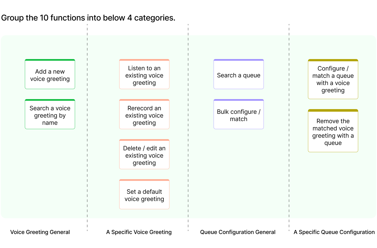
To restructure the information hierarchy, I organized the functions into four main categories. The first two categories are about voice greetings, while the last two are about matching queues with their associated voice greetings.
Design Example
3. Dashboard Data Visualization
In a B2B application, the dashboard serves as a centralized space for displaying essential metrics and data.
In the legacy version shown below, the dashboard lacked several critical function widgets, used space inefficiently, and offered limited customization options.
In my proposed new designs, I enhanced the overall dashboard page by focusing on those 5 areas:
-
Introduce Responsive Widget Sizing:
-
In the previous product, each widget occupied the entire row on the dashboard, leading to excessive white space and increased vertical scrolling. To address this, propose designing each widget with responsive sizing that adapts to the browser width. This will optimize information density and reduce unnecessary scrolling.
-
Enable Drag & Drop Functionality:
-
Introduce drag-and-drop functionality for widgets to accommodate different user preferences. This will allow users to easily reposition widgets to their preferred locations on the dashboard, creating a more personalized and efficient workspace. Users should be able to drag and resize a widget.
-
Support Widget Customization:
-
Empower users by offering the ability to pick and choose which widgets they want to display on their dashboard. This ensures that users have quick access to the information most relevant to their needs.
-
Add a “Favorites” Widget:
-
Introduce a new “Favorites” widget that displays a list of favorite contacts directly on the dashboard. From this widget, users can quickly initiate calls, send messages, or view contact information, streamlining their communication processes.
-
Elevate “Queues” to Dashboard Widget:
-
Transform “Queues” into a prominent dashboard widget that provides users with an overview of all the queues they are logged into. This feature will make it easier for users to monitor queue statuses and log out of specific queues as needed.
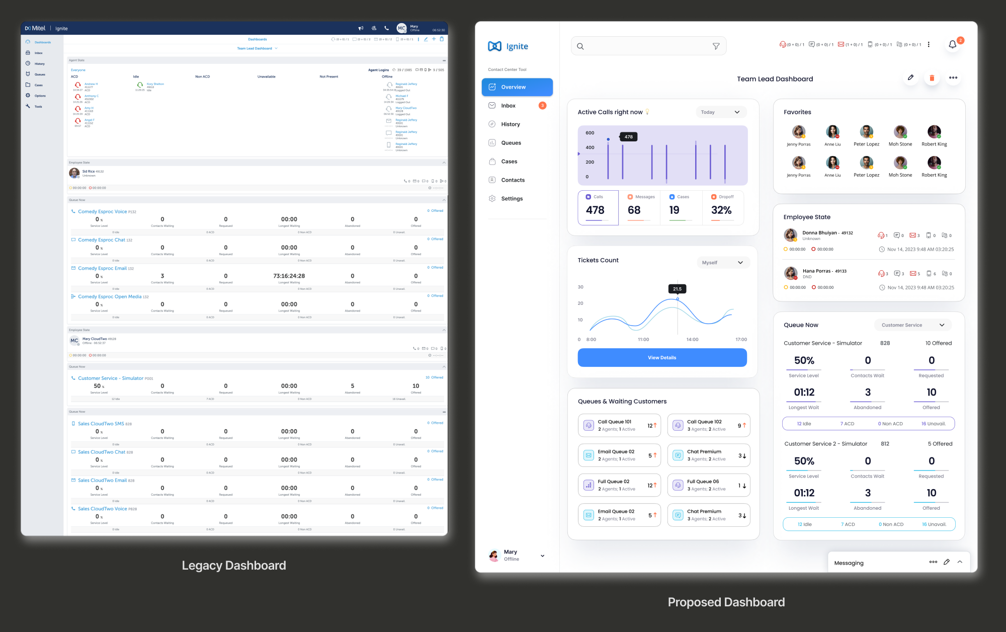
Take a look at my proposed design
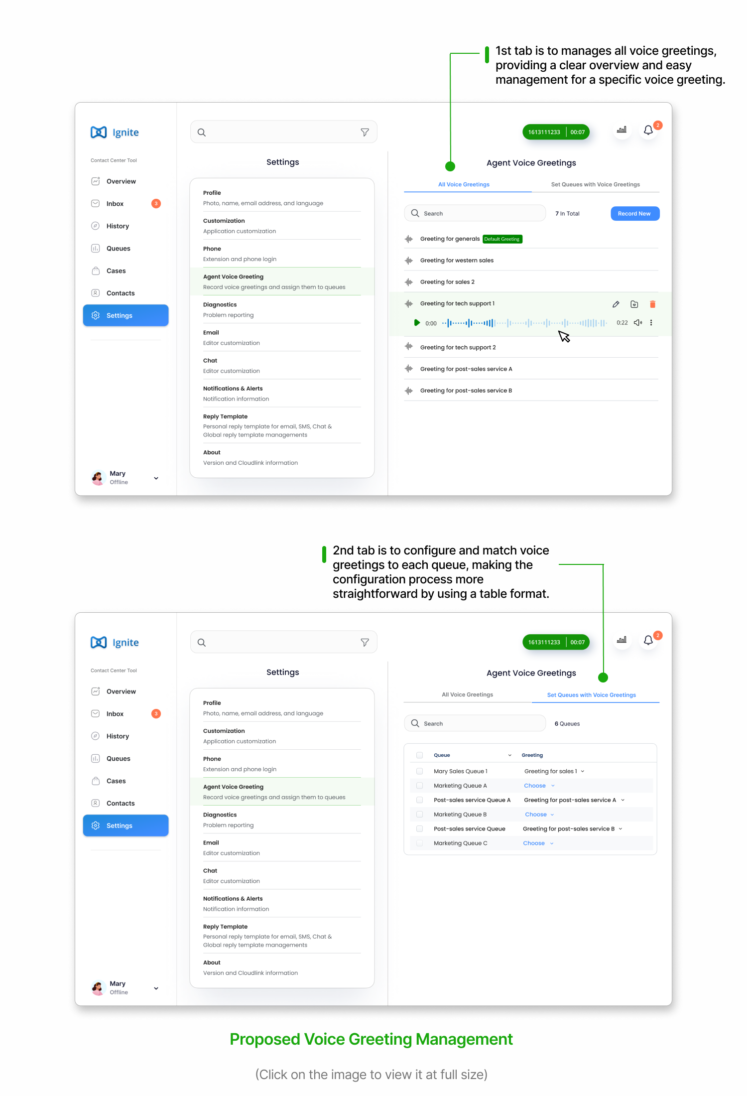
Based on the new functionality hierarchy, I created two distinct tabs within the agent greeting management section to streamline the workflow for agents.
-
The first tab allows agents to manage all voice greetings, offering a clear overview and easy control over individual greetings.
-
The second tab configures and assigns voice greetings to specific queues, simplifying the process through a table format. This design also supports bulk actions, enabling agents to select multiple rows at once to enhance efficiency.
Key Takeaways
-
Incorporating channel partners and customer support: It’s crucial to integrate the insights and feedback from channel partners and the customer support team. These teams have strong relationships with customers and end users, and they’re often the first point of contact when customers encounter issues with the product.
-
Embrace bold conceptual design with ambiguity and iterative ideation: Take advantage of opportunities in user research and surveys to go beyond questions about daily workflows, app usage patterns, and pain points with existing products. Present conceptual designs and ideas based on best practices to elicit clear, actionable feedback. Always probe deeper by asking “why” to uncover underlying and hidden user needs.
As Mitel’s larger suite of B2B Unified Communications solutions, Ignite’s primary users are:
-
Contact Center Agents
-
Contact Center Supervisors
Target Users